Design Methods: Venn Diagram

We are all familiar with the Venn Diagram. You might have used it in your literature class to compare two characters from a book, or to decide which city to travel to. The venn diagram is designed just for that, to compare and contrast different ideas.
Typically you have two overlapping circles, each representing a different idea, though one can use three, four, or even five circles. However, the more circles there are, the more complicated and convoluted the diagram looks. Inside each circle, where they are not overlapping, you write down the information that is unique to a single idea. In the overlapping area you write down information that both ideas have in common.
For example, you might compare an apple and an orange. On the apple side you would put that the apple is red and their outer layer is thin. On the orange side you would put that their color is orange and their outer layer is thick. And on the center you would put that they are both fruits and both have seeds.
Our design strategies team decided to use a Venn diagram towards the end of the empathize phase after we had interviewed many people. We had gathered a lot of data from different sources, but still had not made concrete connections between the data and the issue we wanted to take on. Thus, this method would help us organize the data and start to see patterns and key ideas.

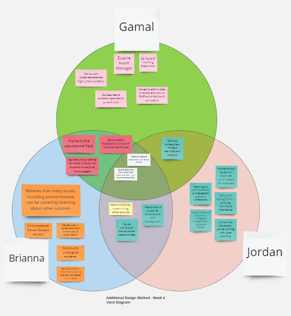
We decided on doing a three-circle Venn diagram to compare and contrast three different people and their ideas. We used data collected from Gamal Sherif, an EcoRise Event Manager, Briana Duran, a UT student advisor for the Environmental Center, and Jordan Frazin, a former intern from the Center of Maximum Potential Building System.
The Venn diagram really helped putting key ideas into perspective. The most important ideas were the ones everyone were talking about, so the ideas that were overlapping between our people. Some of these key ideas that stood out were that most value a workplace that empowers people to lead, believe that bureaucracy hinders learning and progress, and all believed that there should be more representation within the environmental field.
Now that we have collected some key ideas, we could more efficiently begin and continue the defining phase of the design process. Starting with these ideas we would need to see if other people had similar views and start defining issues and making connections to our solution..
Conclusion:
The Venn diagram is good to use to compare and contrast different sets of data. One begins to see what are some of the common things that keep coming up, these similarities can be used as key components. Thus, this method is best used towards the end of the empathize phase or during the defining phase of the design process.
Some of the issues with this method are that one can really only use 2–5 sets of data because having more would make it very difficult to make and organize, at which point another method might be more efficient. This method also only organizes information to see similarities and differences, it does not provide solutions nor does it defines concrete issues, but begins the conversation to them.
